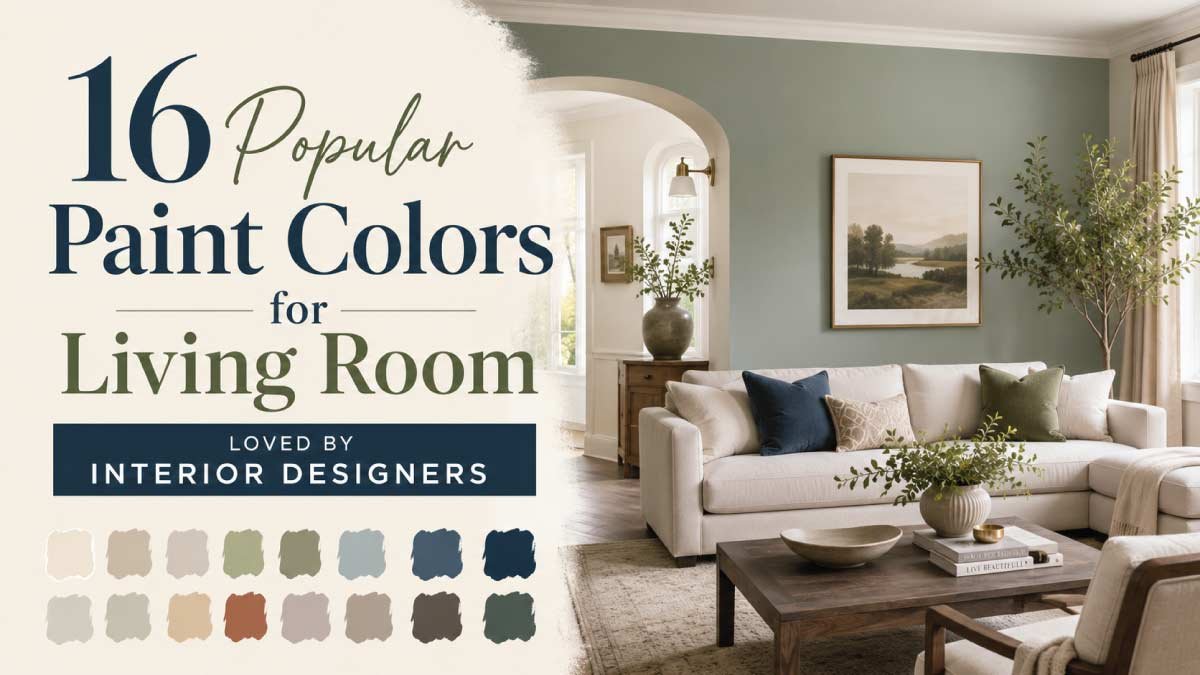
Choosing the right designer-approved living room paint colors can completely elevate the style and atmosphere of your home. Interior designers carefully select colors that not only look beautiful but also create balance, warmth, elegance, and timeless appeal.
Whether you prefer modern neutrals, earthy greens, bold navy tones, or soft luxury shades, the right paint color can make your living room feel brighter, cozier, and far more sophisticated.
In this post, we have gathered some of the best living room paint colors designers love for creating stylish and welcoming interiors. From warm white and greige to sage green and navy blue, these colors work beautifully in both modern and classic homes while helping your living room feel polished, comfortable, and professionally designed.
🏡 My Personal Experience
When I first started choosing paint colors for my living room, I focused only on trendy shades I saw online. Some looked beautiful in pictures but felt completely different once they were on my walls.
After experimenting with a few colors, I finally understood why interior designers often recommend warm neutrals and earthy tones—they create a much more balanced and comfortable atmosphere in real life.
One of the best changes I made was switching from a cold bright white to a soft warm greige. The room instantly felt more elegant, cozy, and visually calm without needing expensive decor changes.
Since then, I have realized that the best living room paint colors are the ones that make your home feel welcoming every single day, not just stylish in photos. That’s why designer-loved colors work so well—they combine beauty, comfort, and timeless style together.
1. Warm White for Timeless Designer Look
Warm white is one of the most recommended paint colors by interior designers because it creates a clean, elegant, and flexible base for any living room. Unlike stark white, warm white has soft undertones of cream or beige that make the space feel inviting instead of cold.
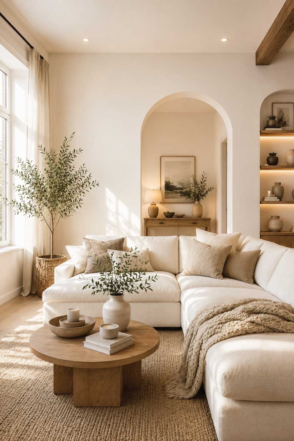
Designers love this color because it works with every style—modern, classic, Scandinavian, and luxury interiors. It also allows furniture, artwork, and textures to stand out without competing with wall color.
Warm white reflects natural light beautifully, making rooms feel larger and brighter. It is especially useful in smaller living rooms or spaces with limited sunlight. To elevate the look, designers often pair it with wood textures, soft fabrics, and warm lighting.
Benefits:
- Timeless and versatile choice
- Makes room feel bright and spacious
- Works with all interior styles
- Perfect backdrop for decor
- Enhances natural light
2. Greige (Gray + Beige) for Modern Elegance
Greige is a favorite among interior designers because it perfectly blends the warmth of beige with the modern feel of gray. This makes it one of the most balanced and stylish neutral tones for living rooms.
It adapts easily to different lighting conditions, appearing warmer in natural light and cooler under artificial lighting. This flexibility makes it ideal for both small apartments and large homes.
Greige pairs beautifully with black accents, wooden furniture, and metallic decor, allowing designers to create layered and sophisticated interiors. It is a go-to color for modern, transitional, and luxury living spaces.
Benefits:
- Perfect balance of warm and cool tones
- Extremely versatile neutral color
- Works in any lighting
- Modern and sophisticated look
- Easy to pair with decor
3. Soft Sage Green for Natural Designer Style
Soft sage green is widely loved by interior designers for its calming, nature-inspired aesthetic. It brings a fresh and organic feel to living rooms while still maintaining elegance and subtlety.
This color works especially well in modern natural, Scandinavian, and eco-friendly designs. Designers often pair it with white walls, light wood furniture, and indoor plants to enhance the peaceful atmosphere.
Sage green creates a soft pop of color without overwhelming the space, making it perfect for both accent walls and full-room painting. It promotes relaxation and balance in home interiors.
Benefits:
- Calming and refreshing tone
- Nature-inspired elegance
- Works with modern interiors
- Soft and non-overpowering
- Enhances peaceful mood
4. Navy Blue for Bold Designer Statement
Navy blue is a classic designer-approved color that adds depth, luxury, and drama to living rooms. It is often used for accent walls or statement areas because of its strong visual impact.
Interior designers love navy blue because it pairs beautifully with white, gold, brass, and wooden elements, creating a rich and balanced look. It works especially well in modern luxury, coastal, and contemporary interiors.
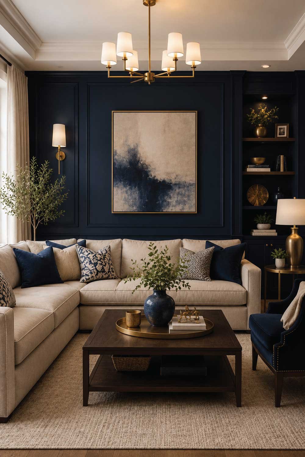
When used correctly with proper lighting, navy blue makes a room feel sophisticated, cozy, and high-end at the same time.
Benefits:
- Bold and elegant statement color
- Adds depth and richness
- Works with luxury decor
- Timeless designer favorite
- Creates strong focal points
Don’t Miss Our Most Trending Ideas:
16 Living Room Accent Wall Ideas That Add Personality to Your Space
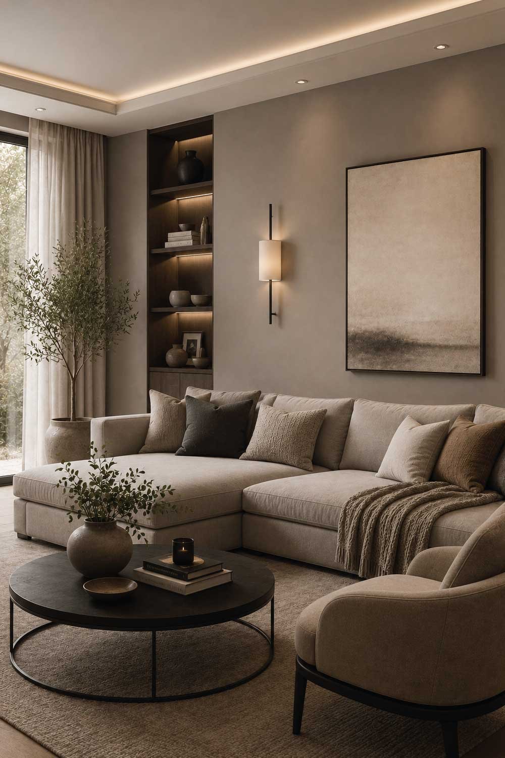
5. Soft Taupe for Sophisticated Neutral Elegance
Soft taupe is a designer-favorite neutral that sits perfectly between gray and beige, making it one of the most balanced paint colors for living rooms. Interior designers often use it when they want a calm, refined backdrop that feels modern but still warm and livable.
This shade works beautifully in both small and large spaces because it adapts well to lighting—appearing slightly warmer in natural light and more muted under artificial lighting. It pairs effortlessly with wood tones, black accents, white trims, and metallic finishes like brass or gold.
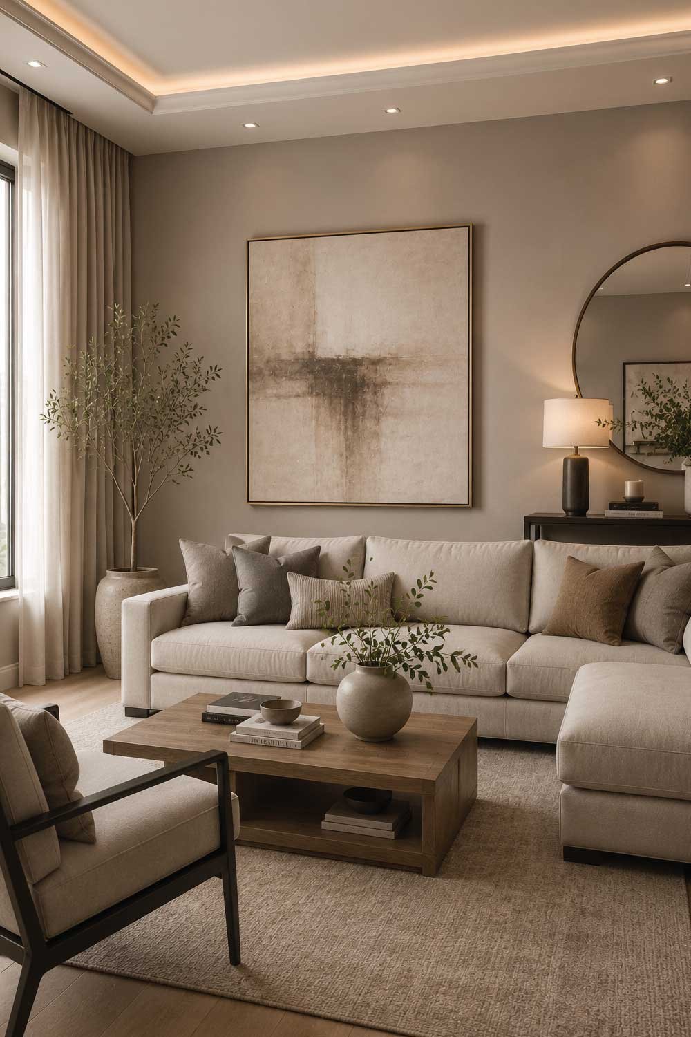
Soft taupe is especially popular in transitional and contemporary interiors where subtle elegance is key. It allows furniture and decor to stand out while still maintaining a cohesive, polished look.
Benefits:
- Balanced warm-neutral tone
- Highly versatile for styling
- Works in all lighting conditions
- Elegant and modern appearance
- Easy to pair with decor
6. Charcoal Gray for High-End Modern Interiors
Charcoal gray is widely used by interior designers to create depth, drama, and sophistication in living rooms. It is darker than standard gray, giving walls a strong visual presence without feeling harsh when styled correctly.
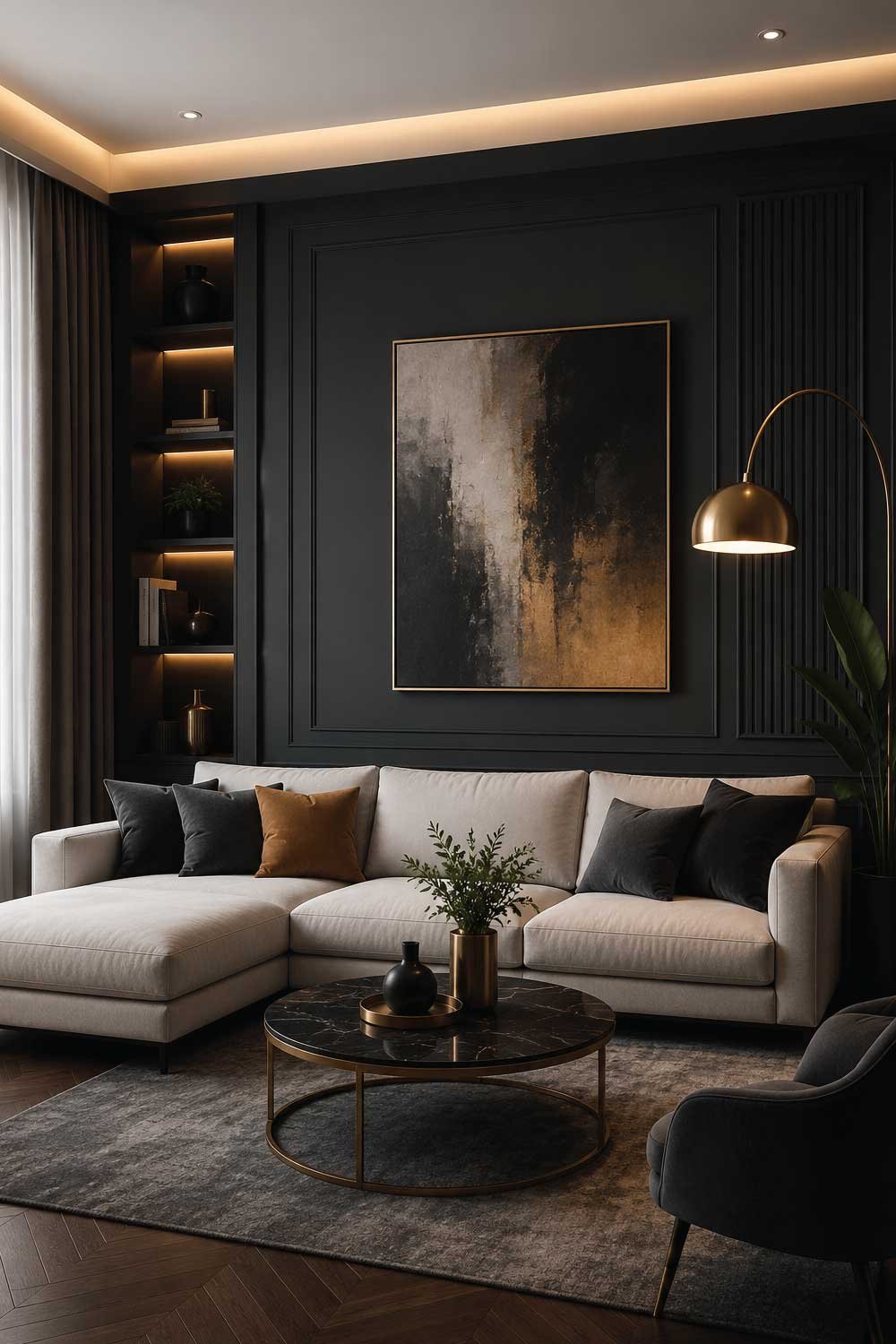
Designers often use charcoal gray for accent walls behind sofas or media units to create a focal point. It pairs exceptionally well with white furniture, wooden textures, and metallic accents, especially gold or copper.
When combined with warm lighting, charcoal gray transforms into a cozy yet luxurious backdrop. It is a top choice for modern, industrial, and luxury-inspired interiors.
Benefits:
- Creates bold visual impact
- Adds depth and sophistication
- Ideal for accent walls
- Works with luxury materials
- Modern and stylish choice
Don’t Miss Our Most Trending Ideas:
14 Minimalist Living Room Furniture Ideas for a Clean Modern Space
7. Dusty Blue for Calm Designer Spaces
Dusty blue is a soft, muted tone that interior designers love for creating calm and balanced living rooms. It is less intense than navy blue, making it more soothing and versatile for everyday spaces.
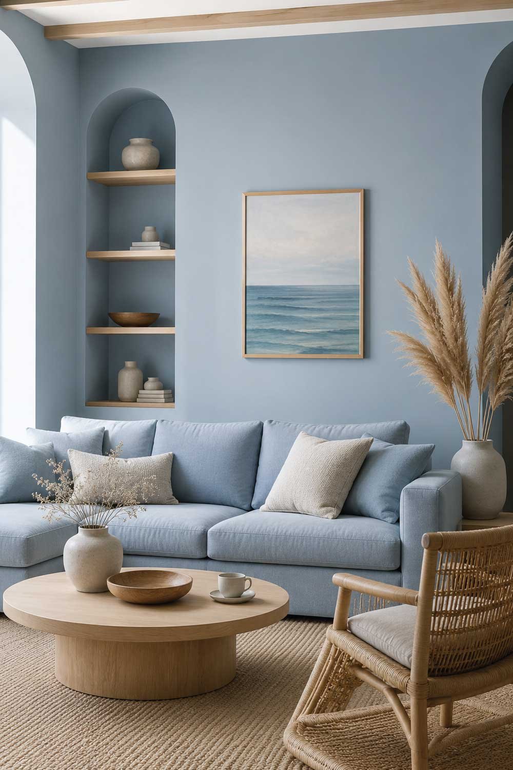
This color works especially well in coastal, Scandinavian, and modern minimalist interiors. Designers often pair it with white walls, beige fabrics, and natural wood elements to maintain a light and airy feel.
Dusty blue brings a gentle hint of color while still feeling neutral enough to remain timeless and elegant. It is perfect for spaces where relaxation and comfort are the priority.
Benefits:
- Calm and relaxing atmosphere
- Soft and elegant color tone
- Works with neutral palettes
- Ideal for modern interiors
- Timeless designer choice
8. Olive Green for Organic Designer Aesthetic
Olive green is a highly popular choice among interior designers for creating warm, natural, and grounded living room spaces. It brings an organic feel that connects indoor spaces with nature.
This shade works beautifully with wood furniture, beige tones, cream accents, and textured fabrics. Designers often use olive green to create cozy, earthy interiors that feel both stylish and relaxing.
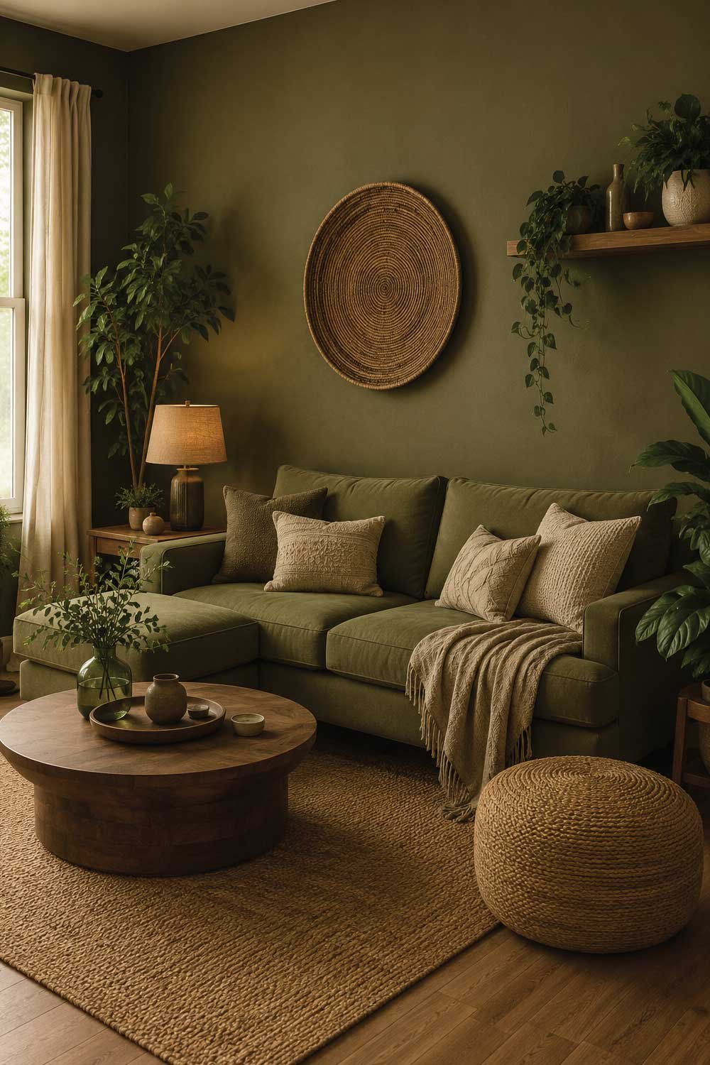
It is perfect for bohemian, rustic modern, and nature-inspired homes where warmth and personality are important. Olive green adds depth without being overly bold, making it a versatile designer-approved color.
Benefits:
- Natural and earthy elegance
- Works with wood and neutral tones
- Adds warmth and depth
- Stylish yet calming choice
- Great for cozy interiors
Don’t Miss Our Most Trending Ideas:
9. Cream White for Soft Luxury Interiors
Cream white is a designer-approved classic that adds softness, warmth, and quiet luxury to living rooms. Unlike pure white, it has a gentle yellow or beige undertone that makes the space feel more inviting and comfortable.
Interior designers often use cream white as a base color because it works with almost any style—modern luxury, traditional elegance, or minimal interiors. It pairs beautifully with gold accents, wooden furniture, and soft fabrics like linen or velvet.
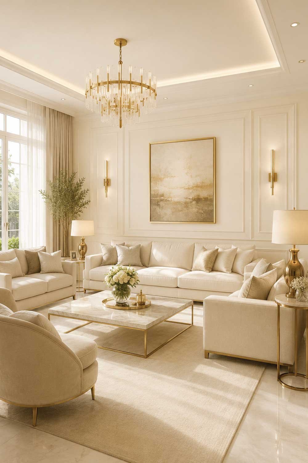
This color also enhances natural light without creating a harsh or cold effect. It helps the room feel open, airy, and balanced while maintaining a cozy atmosphere.
Benefits:
- Soft luxury and elegant feel
- Warmer than pure white
- Works with all decor styles
- Enhances natural light
- Timeless designer choice
10. Beige for Classic Designer Warmth
Beige is one of the most trusted paint colors used by interior designers for creating warm and timeless living rooms. It offers a soft, neutral base that feels both cozy and elegant without being overwhelming.
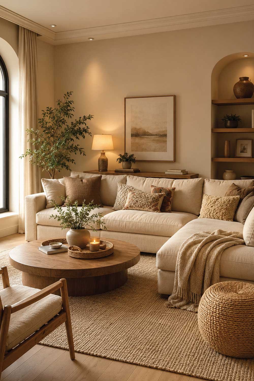
Designers use beige because it provides flexibility in styling—you can pair it with bold colors, soft pastels, or rich dark tones. It works especially well in family living rooms where comfort and practicality matter.
Beige walls create a calm and stable environment that feels welcoming in any season. It also works perfectly with wood, rattan, and natural textures for a balanced interior look.
Benefits:
- Warm and inviting tone
- Highly versatile neutral color
- Works with any decor style
- Great for cozy interiors
- Designer-approved classic
Don’t Miss Our Most Trending Ideas:
11. Black Accent Walls for Bold Luxury Design
Black is a powerful design choice that interior designers use strategically for creating bold, high-end living rooms. It is usually applied as an accent wall rather than full-room paint to avoid making the space feel too dark.
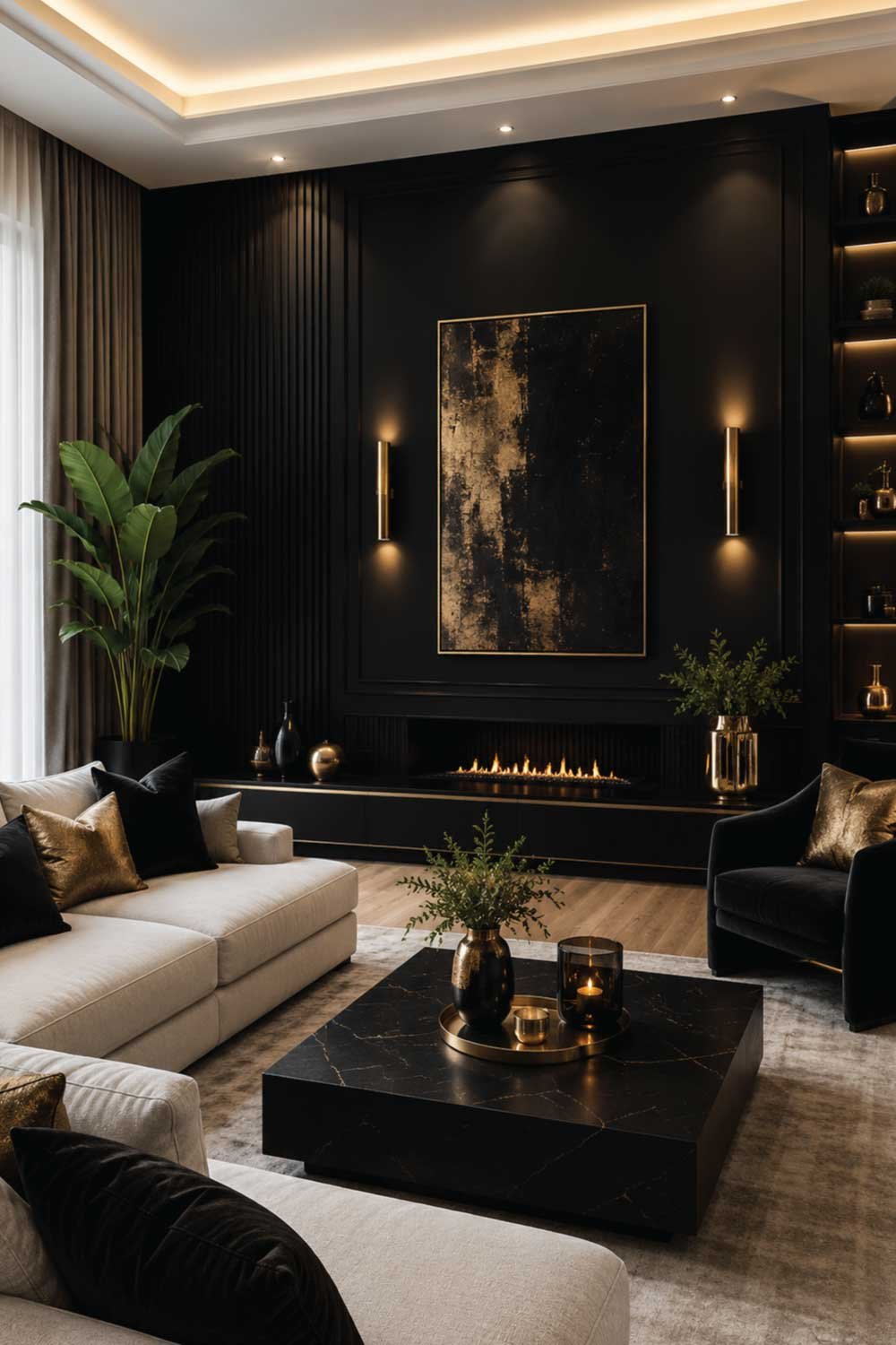
When paired with white, gold, or wood tones, black creates a dramatic and luxurious contrast. It is often used behind sofas, fireplaces, or media units to define focal points.
Proper lighting is essential when using black walls, as it enhances depth and prevents the space from feeling heavy. Designers love black for modern, industrial, and luxury interiors.
Benefits:
- Bold and dramatic effect
- Creates luxury statement walls
- Strong visual contrast
- Works with modern decor
- Defines focal points
12. Soft Blush Pink for Modern Elegant Spaces
Soft blush pink is a subtle, sophisticated color that interior designers use to add warmth and softness to modern living rooms. It is not overly bright, making it feel calm and elegant rather than childish.
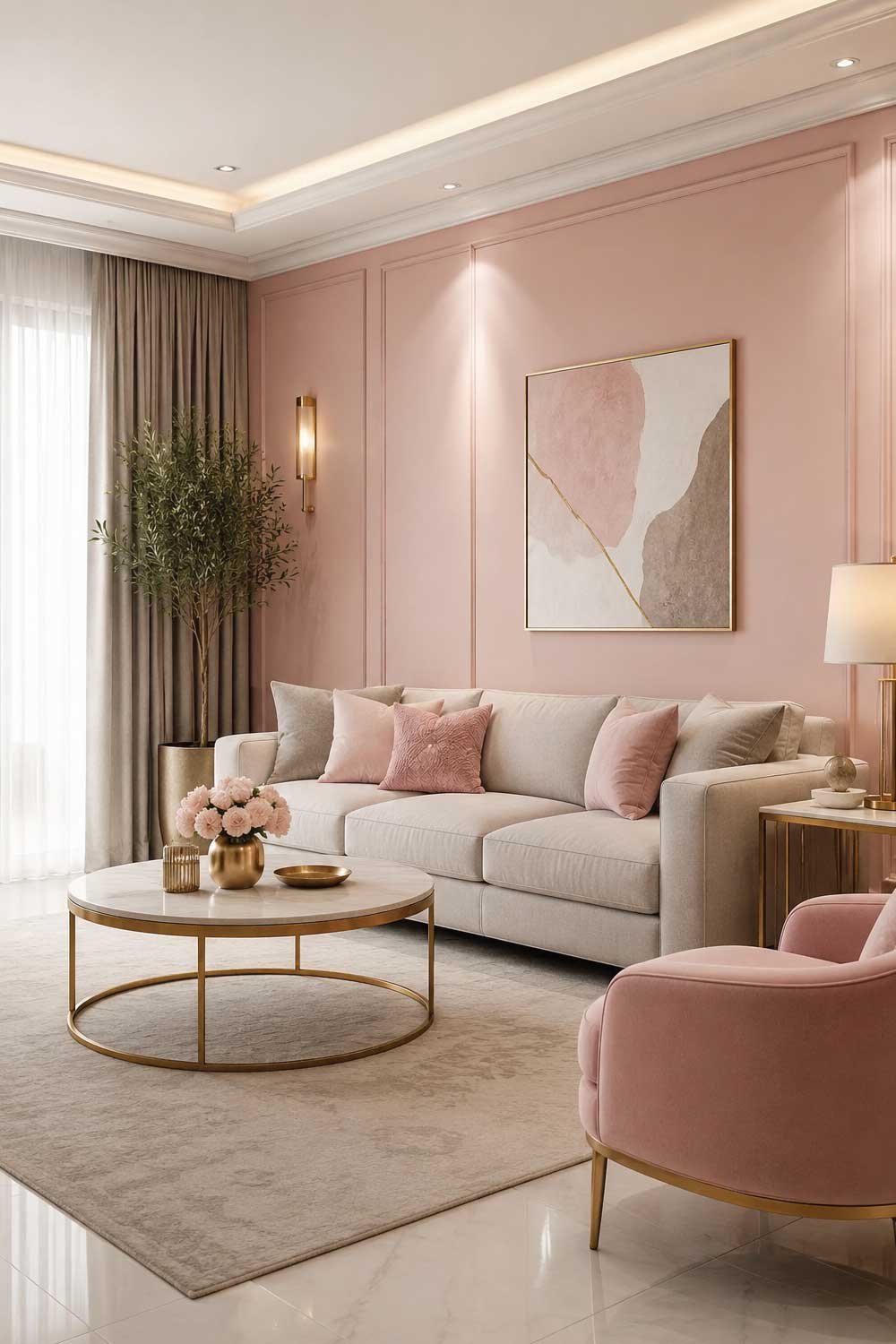
This color pairs beautifully with gray, white, beige, and gold accents. It works well in contemporary, feminine, and soft luxury interiors where a gentle pop of color is desired.
Blush pink adds personality while keeping the space light and airy. It is often used in feature walls or combined with neutral palettes for balance.
Benefits:
- Soft and elegant color tone
- Adds gentle warmth
- Works with neutrals and gold
- Modern and stylish look
- Subtle personality boost
Don’t Miss Our Most Trending Ideas:
13. Light Gray for Clean Modern Design
Light gray is a staple in interior design because it offers a clean, modern, and flexible base for living rooms. It is softer than charcoal and works well in both bright and dim lighting conditions.
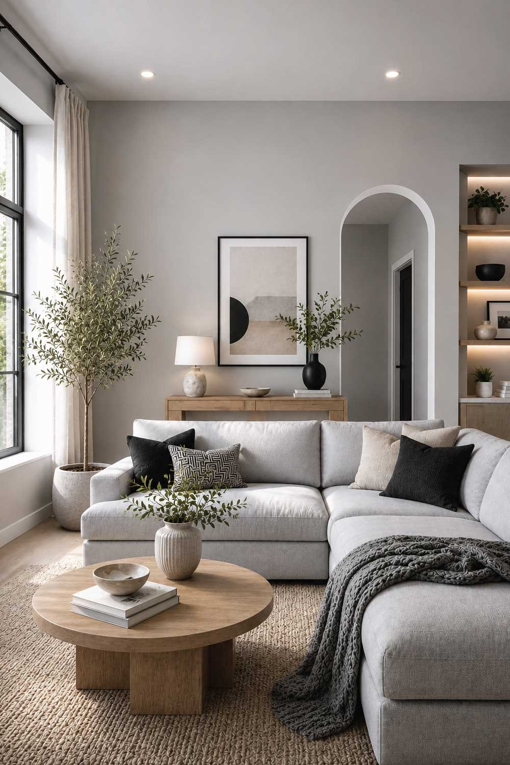
Designers use light gray because it allows furniture and decor to stand out without competing with wall color. It works perfectly with white, black, wood, and metallic accents.
This color is ideal for minimalist and contemporary homes where simplicity and elegance are key design goals.
Benefits:
- Clean and modern appearance
- Highly versatile neutral
- Easy to decorate around
- Works in all lighting
- Designer favorite base color
14. Terracotta for Warm Designer Earthy Style
Terracotta is a rich, earthy color that interior designers love for creating warm, grounded, and character-filled living rooms. It is inspired by natural clay tones, giving the space a cozy Mediterranean or bohemian feel.
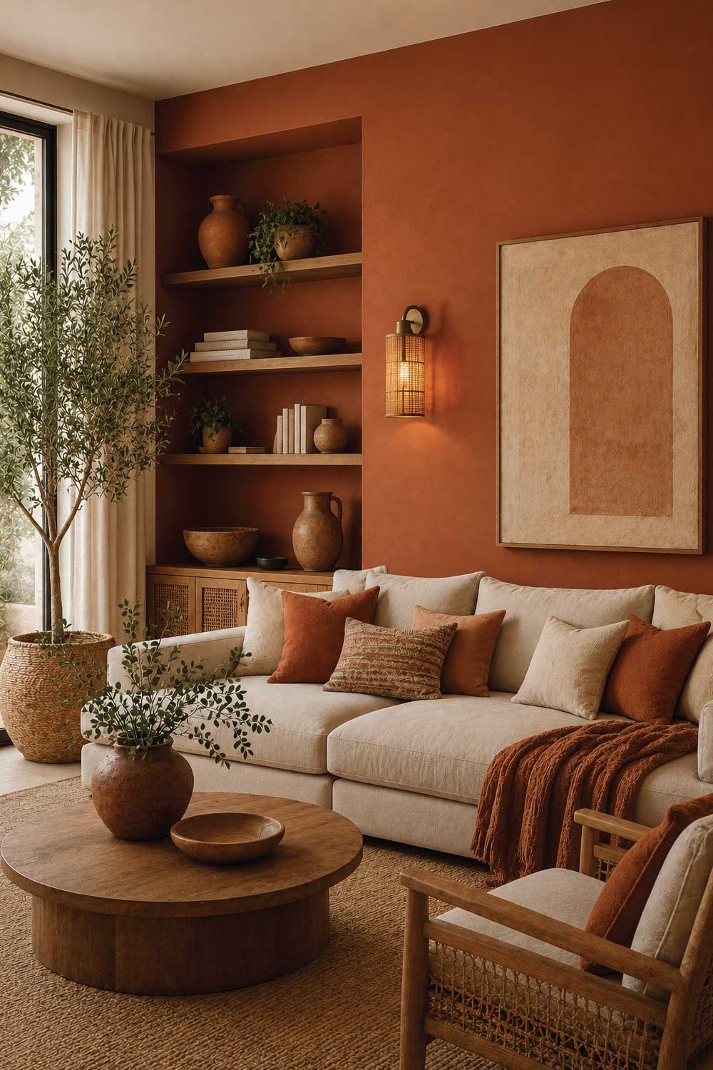
Designers often use terracotta as an accent wall or paired with neutral bases like beige, cream, or soft white. It works beautifully with natural materials such as wood, rattan, and linen, enhancing the organic look of the space.
This color adds instant warmth and personality, making the living room feel inviting and full of life. With soft lighting, terracotta creates a glowing, comforting atmosphere that feels both stylish and natural.
Benefits:
- Warm and earthy designer tone
- Adds strong personality
- Works with natural materials
- Cozy and inviting atmosphere
- Perfect for boho and rustic styles
Don’t Miss Our Most Trending Ideas:
How to Make a Small Home Look Stylish: Clever Tips for Chic Living
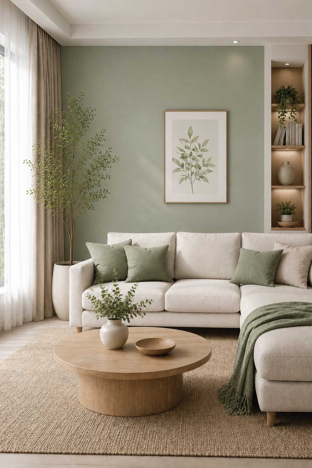
15. Sage Green for Fresh Modern Serenity
Sage green is one of the most popular modern designer colors because it brings calmness, freshness, and natural beauty into a living room. It is soft and muted, making it easy on the eyes and perfect for relaxing spaces.
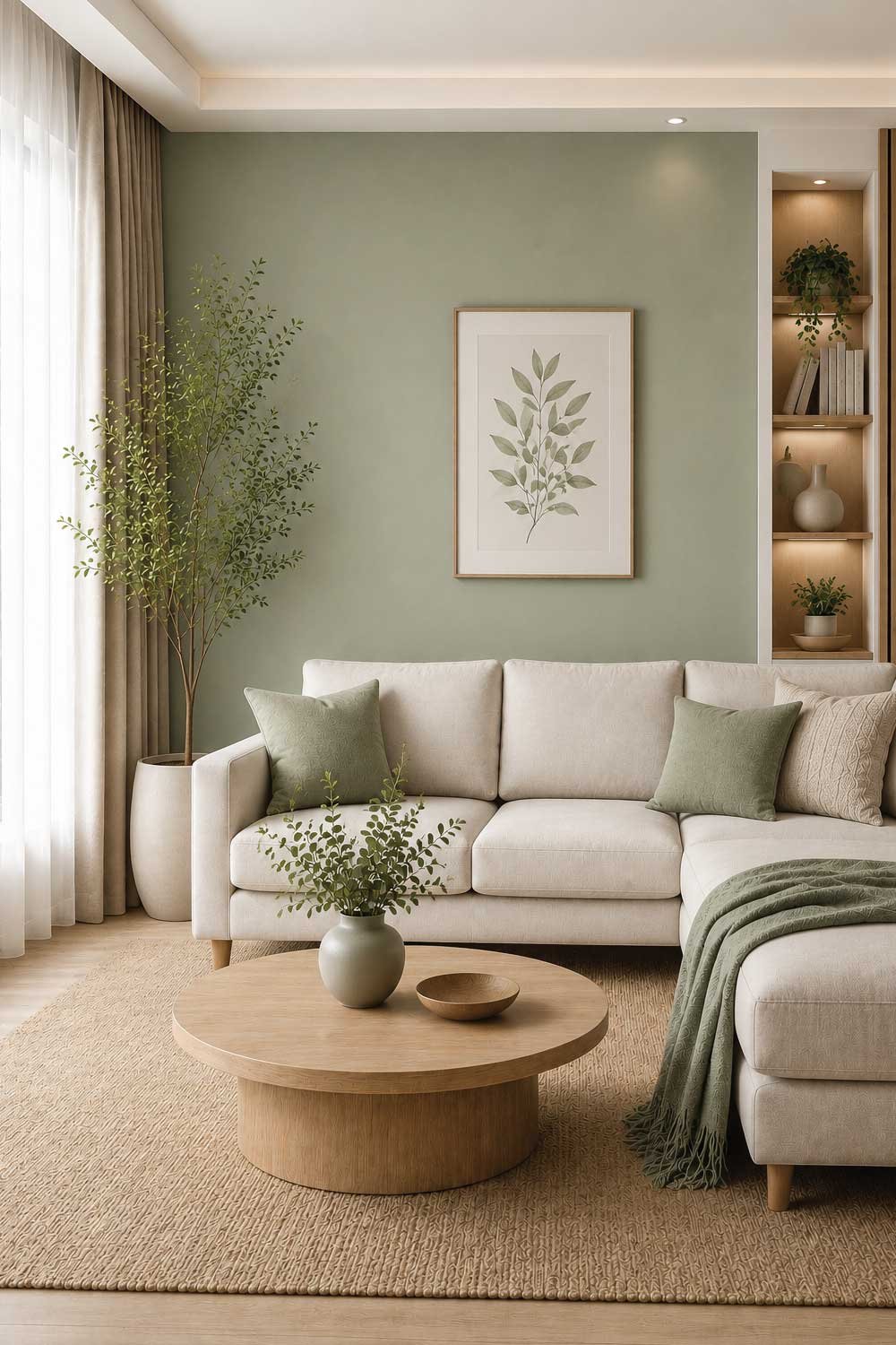
Interior designers use sage green in Scandinavian, modern natural, and eco-inspired interiors. It pairs well with white walls, light wood furniture, and beige textiles, creating a balanced and peaceful environment.
This color works for both full walls and accent walls, adding a subtle hint of nature without overwhelming the design. It helps create a refreshing and stress-free living space.
Benefits:
- Calm and refreshing tone
- Nature-inspired elegance
- Works with neutral palettes
- Soft and modern look
- Great for relaxation
16. Navy Blue for Timeless Designer Elegance
Navy blue is a classic interior designer favorite because it brings depth, elegance, and a sense of luxury to living rooms. It is bold but still refined, making it perfect for statement walls or focal areas.
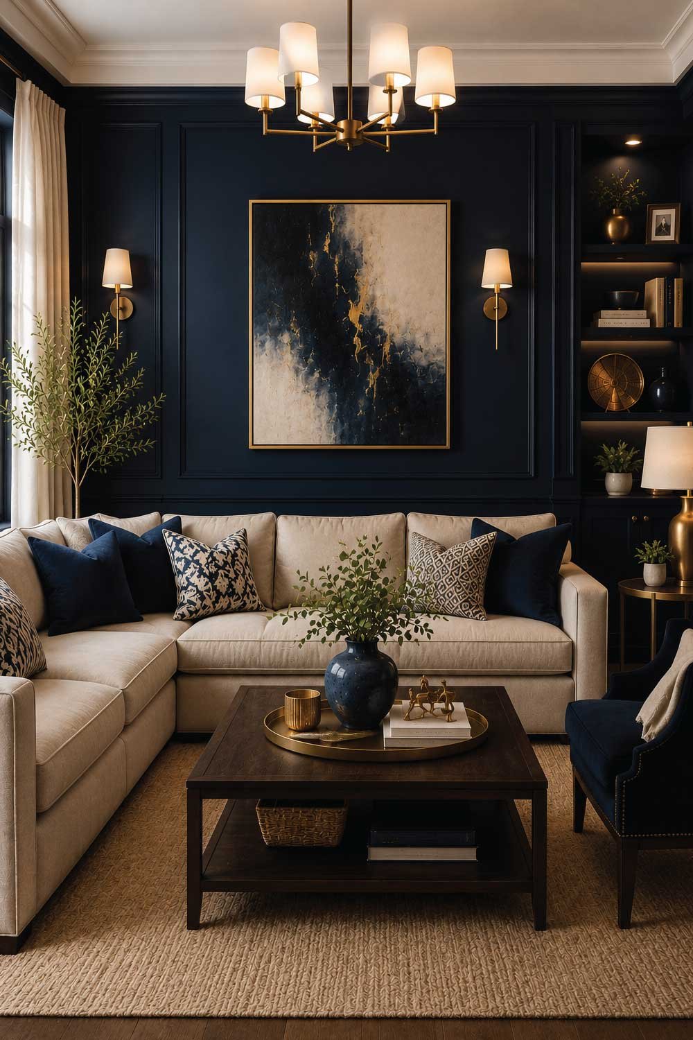
Designers often combine navy blue with white, gold, or natural wood to create a balanced and sophisticated interior. It works especially well in modern, coastal, and luxury-style homes.
When paired with proper lighting, navy blue creates a cozy yet high-end atmosphere that feels both dramatic and inviting.
Benefits:
- Elegant and timeless color
- Creates strong focal points
- Works with luxury accents
- Adds depth and richness
- Ideal for statement walls
Don’t Miss Our Most Trending Ideas:
How to Maximize Small Spaces: Smart Tips for Comfortable Living

I am Engineer Hassan, a professional engineer with over 15 years of experience in measurements, design accuracy, and furniture, appliance, and home product sizing. Through Size Helper, I provide research-based guides and trending 2026 home design ideas for living rooms, bedrooms, sofas, wall décor, fashion, and sports—helping users make confident, informed decisions. Every guide is written with real expertise, verified data, and a commitment to quality, usability, and style.