
If there’s one thing I have learned from years of experimenting with home décor, it’s this: paint has power. I used to underestimate it, thinking furniture and lighting did most of the “heavy lifting” in a room. But once I started playing around with different living room paint color ideas,.
I realized the walls set the entire mood. In fact, I have repainted my own living room more than once (yes, my family thought I was a little obsessed), and every single time, the space felt like a brand-new home. So today, I am sharing 10 living room paint color ideas that I have either personally tried or closely considered, along with real-life insights on how they actually feel once they’re on the walls.
Whether you are refreshing a cozy apartment or redesigning a big suburban living room, these ideas can help you find a shade that truly fits your lifestyle.
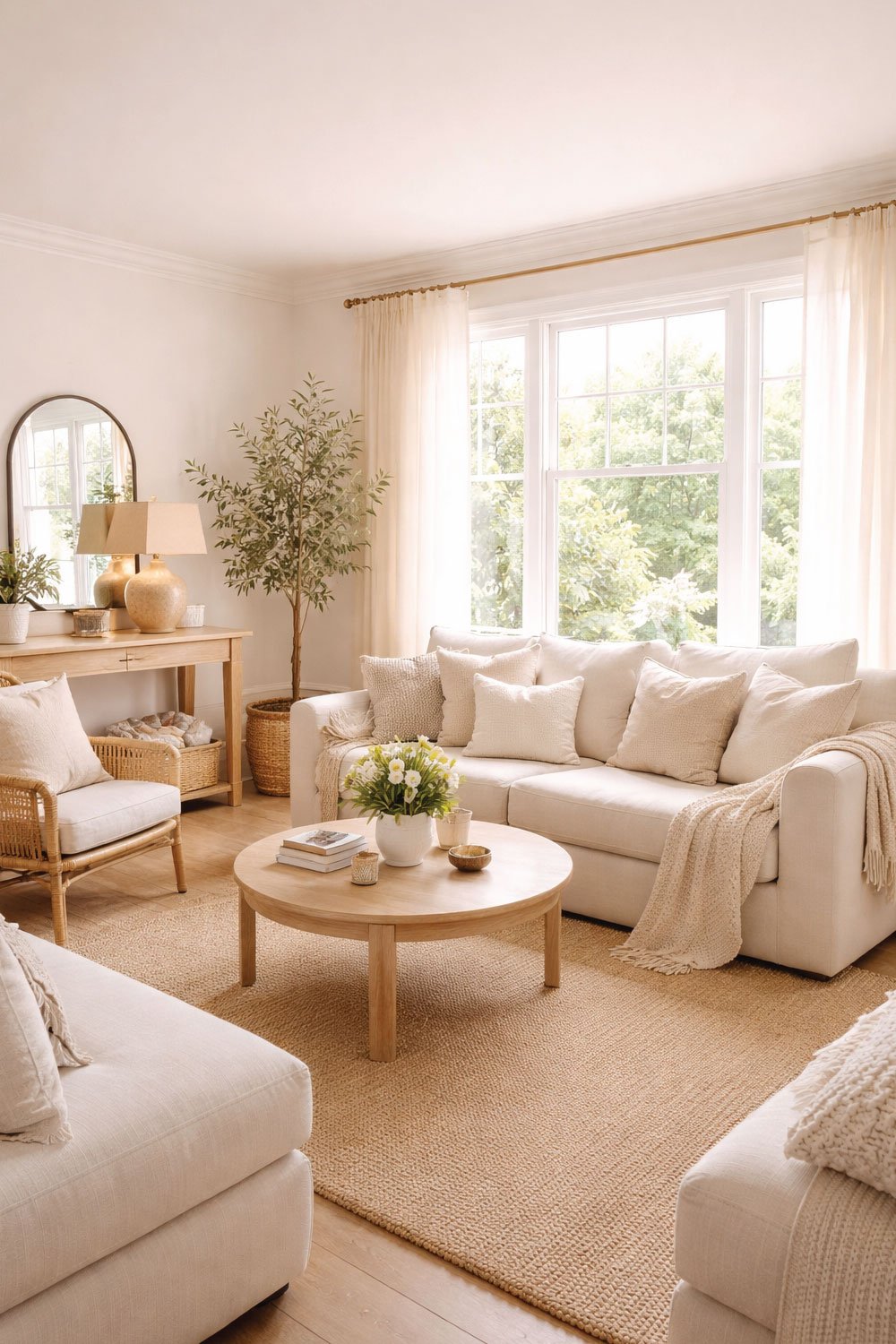
1. Warm White My “Safe But Never Boring” Choice
Warm white has always been my personal reset button when a space feels off. Whenever I’m unsure about color or overwhelmed by options, this shade is where I return. It’s familiar, comforting, and surprisingly powerful in transforming a room.
When I first moved into my current home, the living room felt dark and a bit cramped. Choosing a soft warm white completely changed that feeling. The room instantly felt brighter, more open, and far more peaceful—without losing any warmth or character.
What makes warm white special is that it avoids the harshness of stark, clinical whites. With subtle creamy or beige undertones, it creates an inviting atmosphere that works beautifully in American homes, especially those with large windows and natural light. It’s safe, yes—but never boring.
When I first moved into my current home, the living room felt dark and cramped. I went with a soft warm white, and the transformation was instant. It didn’t just brighten the space—it made everything feel cleaner and calmer.
Unlike stark hospital white, warm white has a hint of cream or beige, which keeps it inviting. It works especially well in American homes that rely on natural light from big windows.
Why I love it:
Makes small rooms look bigger
Works with any décor style
Perfect backdrop for seasonal decorations
If you’re unsure where to start, warm white is the safest bet you’ll never regret.
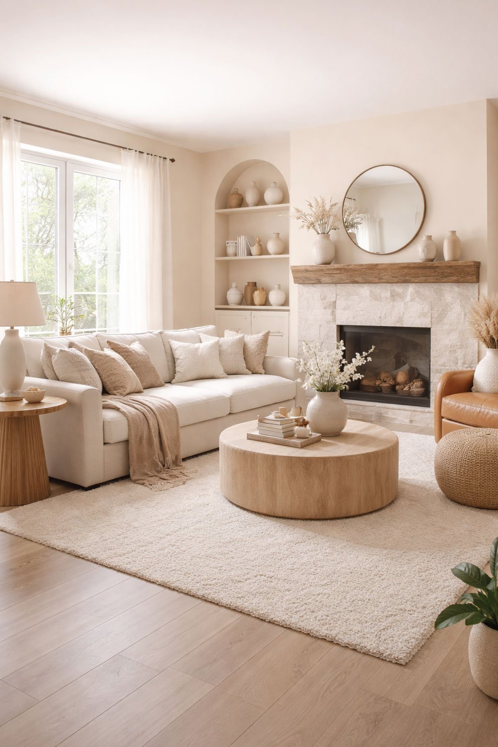
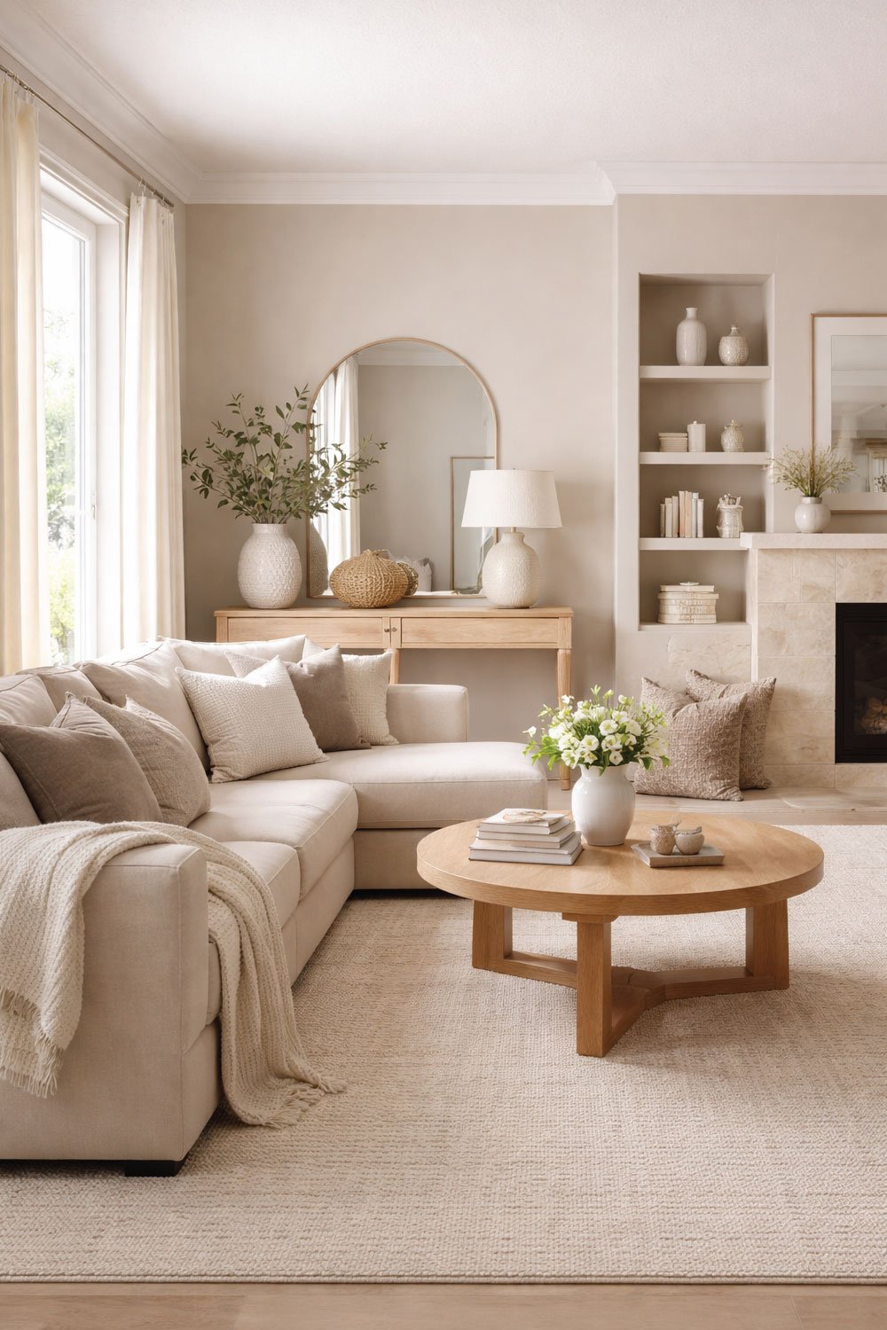
2. Soft Beige – The Cozy Classic
Beige often gets dismissed as dull, but in reality, it’s one of the most comforting and versatile living room colors out there. When done right, it feels timeless rather than outdated.
I realized this when I helped a friend repaint her living room in a soft beige with gentle golden undertones. The change was dramatic. The space suddenly felt elegant and cozy, like stepping into a high-end hotel lounge designed for relaxation.
Soft beige shines in U.S. homes because it complements natural materials so well. Wood floors, leather sofas, and earthy décor all look richer against it. It adds warmth without overpowering the room, making it a perfect choice for people who want cozy but refined.
I once helped a friend repaint her living room in a soft beige with slightly golden undertones, and suddenly her space felt like a luxury hotel lounge. It added warmth without overwhelming the room.
Beige is especially popular in U.S. homes because it pairs beautifully with wood floors, leather furniture, and earthy décor.
Best for:
Cozy, traditional interiors
Homes with natural wood tones
Creating a warm, welcoming vibe
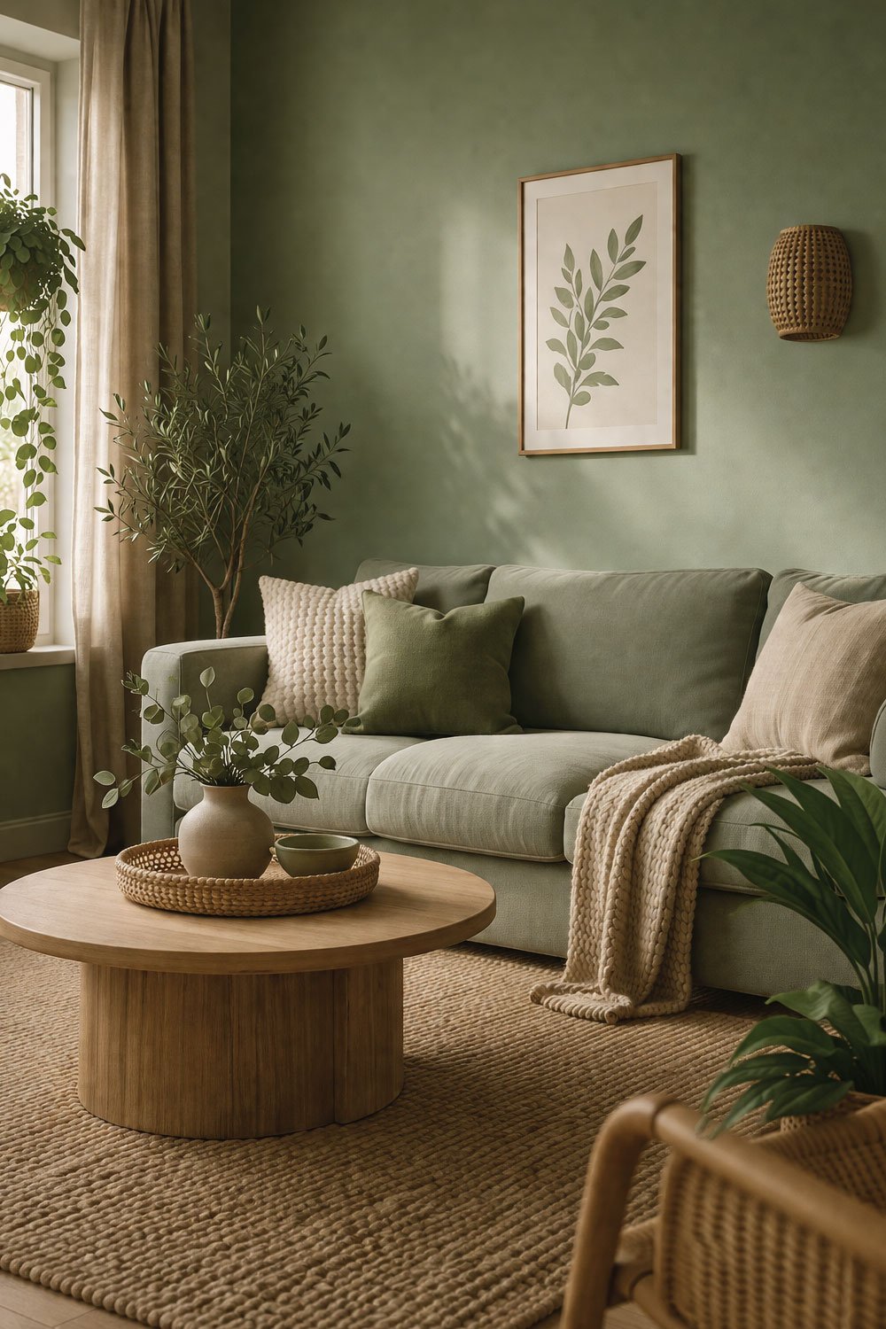
3. Sage Green – Nature Indoors
Sage green is a color I underestimated, until I lived with it. It wasn’t something I planned to love, but once I saw it on my walls, it completely changed my perspective.
I first used sage green in a rental apartment where my design options were limited. Even so, that one color choice made the entire living room feel calmer and more intentional, like a quiet escape from everyday noise.
What I love about sage green is its balance. It brings in natural, earthy energy without being bold or distracting. The muted tone softens the space, reduces visual clutter, and creates a soothing environment—perfect for unwinding after a long day.
The first time I tried it was in a rental apartment where I could not change much but I was allowed to paint. I went with sage green, and suddenly my space felt calmer, almost like a quiet retreat.
It’s soft, muted, and brings a natural, earthy energy into the room without being overpowering.
Why it works so well:
Brings the outdoors inside
Works with boho, farmhouse, and modern styles
Helps reduce visual clutter
If you want your living room to feel peaceful after a long workday, this is a strong contender.
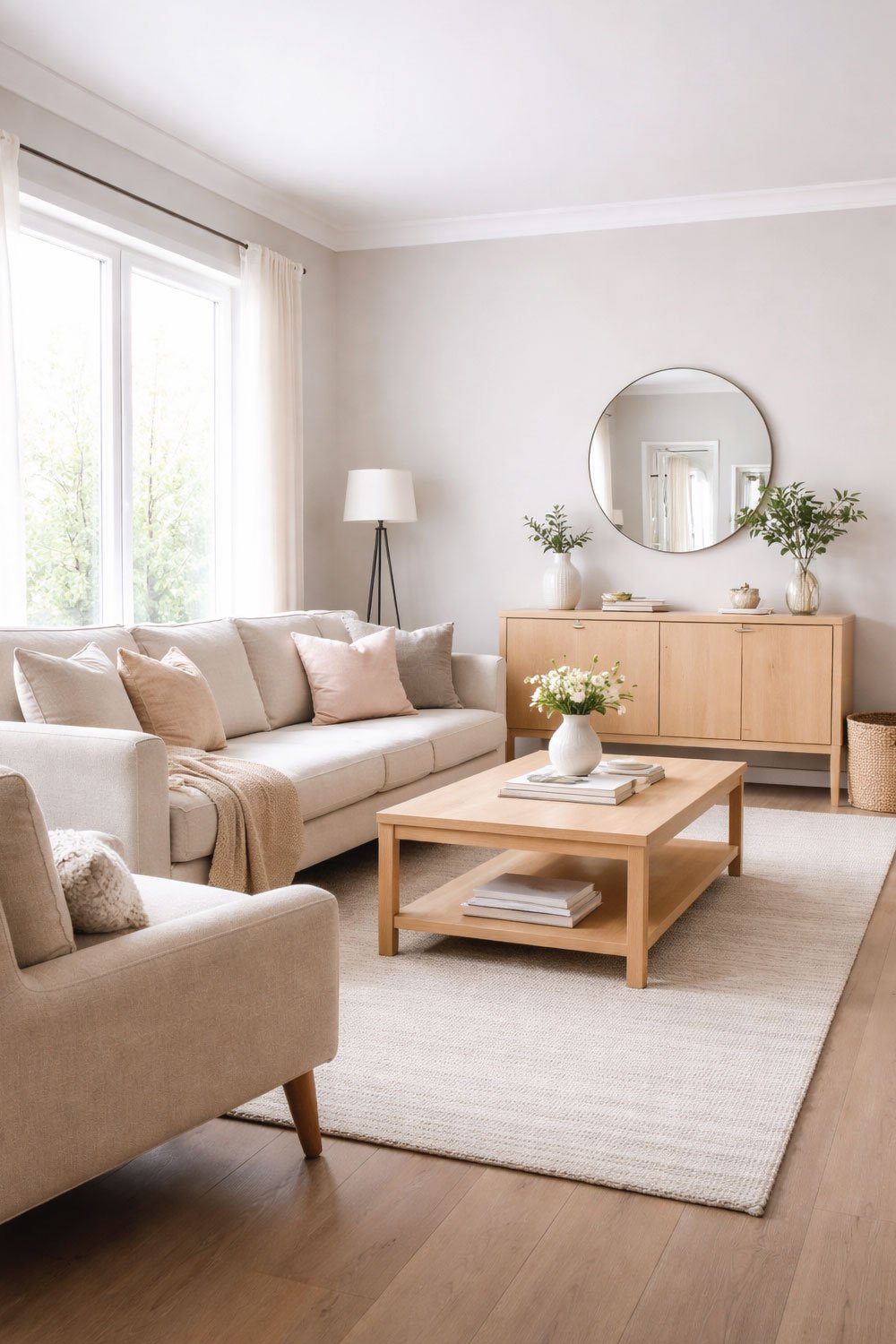
4. Light Gray – Modern and Flexible
Light gray was my “grown-up” color choice—the moment I decided my living room needed to feel more polished and intentional. It marked a shift from temporary furniture to a more cohesive style.
After painting the room light gray, everything instantly felt more modern and refined. The color created a clean foundation that made even simple décor look thoughtful and stylish.
What truly makes light gray stand out is its flexibility. It adapts easily to different moods and design changes, whether you lean industrial with dark accents or cozy with soft textures. Just be sure to choose a warm-toned gray, especially if your living room doesn’t get much sunlight.
I painted my living room light gray when I was trying to transition from mismatched college furniture to something more intentional. It instantly gave the space a modern, polished look.
What I love most is how flexible it is. You can go industrial with black accents or soft and cozy with pastel pillows.
Great for:
Modern and minimalist homes
Open floor plans
People who like changing décor often
Just make sure to choose a gray with warm undertones if your space gets less sunlight.
5. Navy Blue – Bold But Sophisticated
I’ll be honest—navy blue intimidated me at first. I thought it would make my living room feel like a cave. But when I finally tried it on an accent wall, I was shocked at how elegant it looked.
Navy adds drama, but in a refined way. It’s one of those colors that makes even simple furniture look expensive.
I will admit it—navy blue scared me at first. I was convinced it would make my living room feel smaller, darker, and way too dramatic. For a long time, I admired it in photos but never had the courage to try it myself.
That changed when I used navy on a single accent wall behind my sofa. Instead of feeling heavy, the room instantly looked more elegant and intentional. The color added depth and richness without overwhelming the space.
Navy blue has a way of elevating everything around it. Even simple furniture starts to feel high-end, especially when paired with gold, brass, or light-colored décor. If you’re unsure, starting with one wall is the perfect low-risk way to experiment.
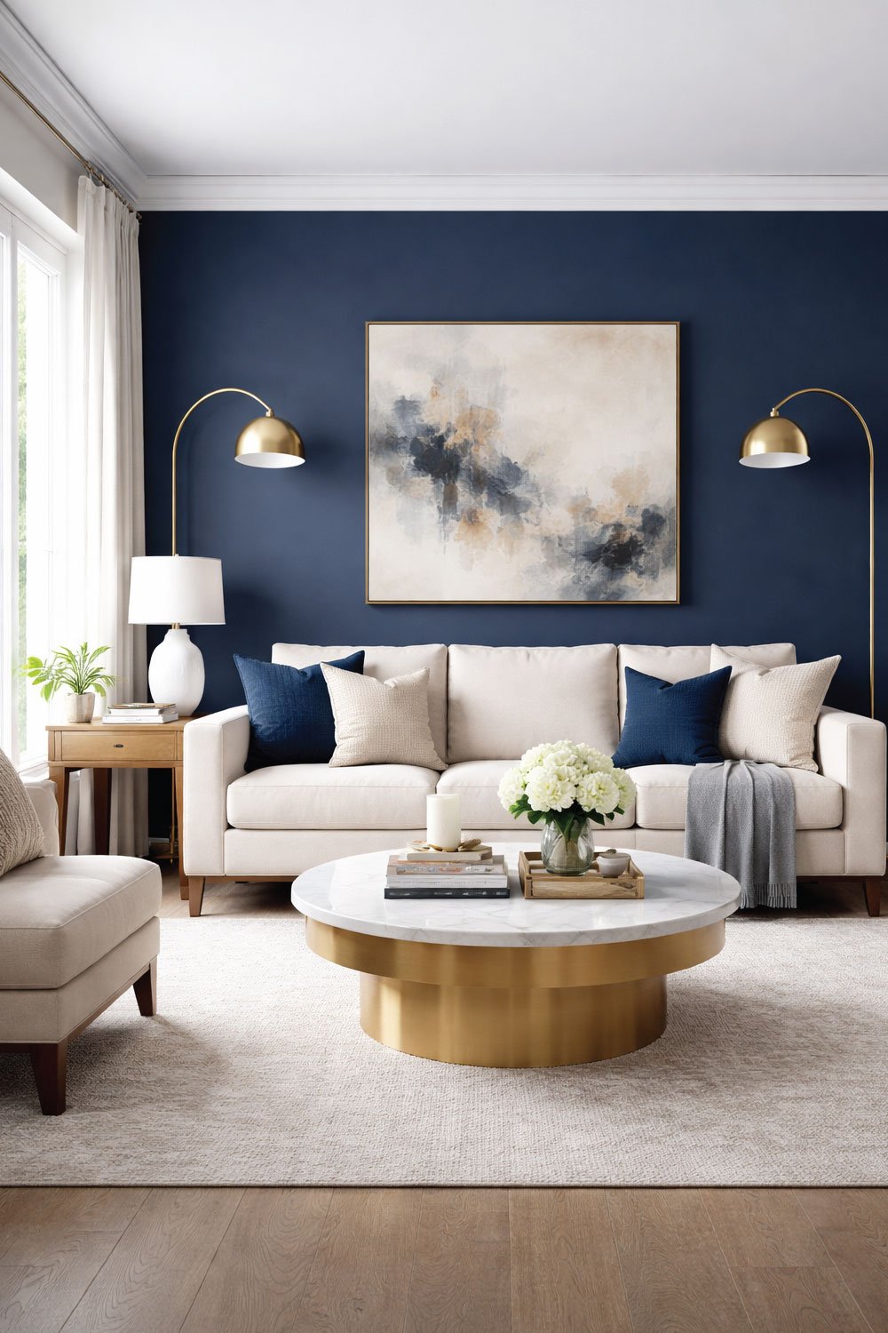
Where it shines:
Accent walls behind a sofa or TV
Rooms with lots of natural light
Pairing with gold or brass décor
If you are hesitant, start small with just one wall.
Also Read:
6. Greige – The Perfect Hybrid
Greige (gray + beige) might sound like a marketing gimmick, but it’s actually one of the most practical paint colors I’ve ever used.
I switched to greige after realizing beige was too warm and gray felt too cold. Greige struck the perfect balance.
It adapts to lighting beautifully, which is why so many American interior designers recommend it.
Greige sounds trendy, but it’s honestly one of the most practical wall colors I’ve ever lived with. It quietly solves the classic debate between beige and gray.
I turned to greige after realizing beige felt too warm in some lighting, while gray came off cold and flat. Greige landed right in the middle, giving me warmth without yellow tones and coolness without feeling sterile.
What makes greige special is how well it adapts throughout the day. Morning light, evening lamps, warm bulbs—it handles them all beautifully. That flexibility is exactly why so many American designers swear by it, especially for living rooms that serve multiple purposes.
Why people love it:
Works in both warm and cool lighting
Extremely versatile
Easy to match with furniture
If you are indecisive like I am, greige is your best friend.
7. Dusty Blue – Calm and Airy
Dusty blue is one of those colors that instantly makes a living room feel peaceful.
I once stayed at a beach house in Florida with dusty blue walls, and I still think about how relaxed I felt there. It reminded me of ocean air and slow mornings.
Back home, I used a similar shade in a reading corner, and it completely changed the mood of that space.
Dusty blue is one of those colors that instantly slows everything down. The moment you walk into a room painted this shade, it feels softer and more relaxed.
I first fell in love with dusty blue during a stay at a beach house in Florida. The walls reminded me of ocean air, open skies, and quiet mornings—and that calm feeling stayed with me long after the trip ended.
Back home, I recreated that mood in a small reading corner using a similar shade. The space became my go-to spot for unwinding. Dusty blue works especially well if you want a peaceful living room that still feels bright and welcoming.
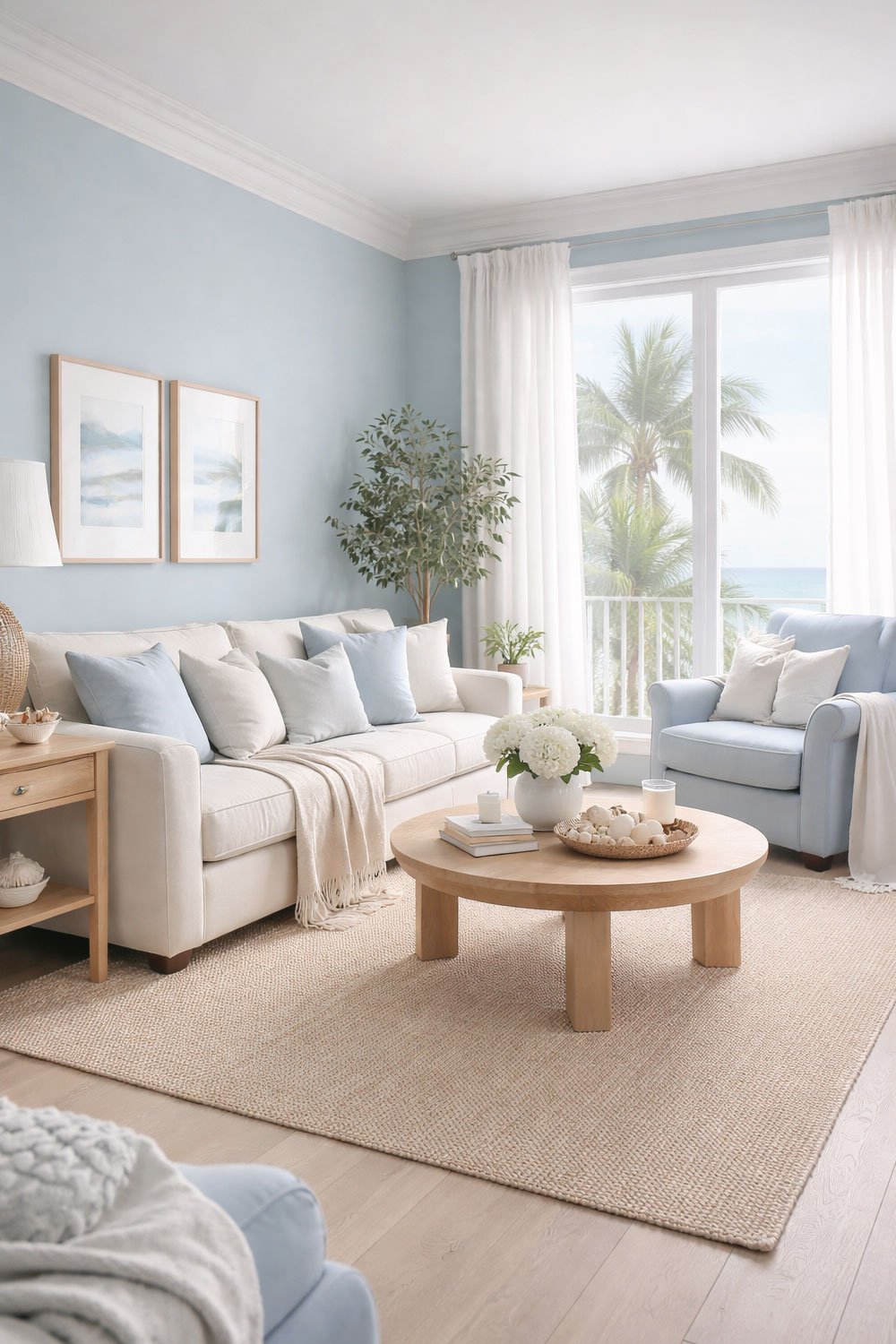
Perfect for:
Coastal-inspired homes
Relaxing, stress-free environments
Pairing with white or light wood furniture
Also Read:
8. Earthy Terracotta – Warm and Inviting
Terracotta was the biggest surprise on this list for me. I always assumed it would be too bold or overpowering for a living room.
That changed when I visited a friend’s Southwest-inspired home. The terracotta walls felt warm, grounded, and incredibly inviting—almost like the room was glowing during sunset.
Earthy terracotta brings instant personality and depth to a space. It pairs beautifully with plants, woven textures, and natural materials, making it ideal for American homes with rustic, Mediterranean, or boho influences. The key is balance—use it thoughtfully, and it becomes unforgettable.
I originally thought it would be too bold, but when I saw it in a friend’s Southwest-style home, I understood the appeal. It felt warm, grounded, and incredibly inviting.
This color works especially well in American homes with rustic or Mediterranean influences.
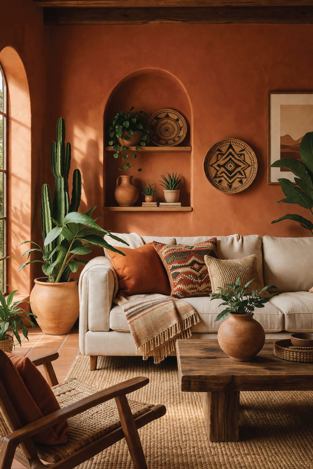
Why it stands out:
Adds personality instantly
Creates a warm, sunset-like glow
Pairs well with plants and natural textures
Just be careful not to overdo it—balance is key.
Also Read:
9. Soft Pastel Peach – Subtle and Cheerful
Pastel peach is like a little boost of happiness on your walls.
I used it in a small living room once where I wanted more warmth without going too bold. The result was soft, cheerful, and surprisingly sophisticated when paired with neutral furniture.
It’s not a color everyone considers right away, but it deserves more attention.
Soft pastel peach feels like a quiet dose of happiness on the walls. It’s warm without being loud and cheerful without feeling childish, which is harder to achieve than it sounds.
I once used it in a small living room where I wanted to add warmth but didn’t want anything overpowering. The color gently lifted the space, making it feel brighter and more welcoming, especially when paired with neutral furniture and soft textures.
It’s not a shade people usually think of first, but that’s exactly why it stands out. Pastel peach adds personality in a subtle way and works beautifully in smaller or darker rooms that need a little extra life without going bold.
Best for:
Small living rooms
Brightening darker spaces
Creating a welcoming, friendly vibe
10. Deep Forest Green – Rich and Dramatic
If I had to pick a favorite from this list, it might be deep forest green.
I painted one wall in this shade behind my bookshelf, and it instantly made the whole room feel like a stylish library. It’s bold, moody, and incredibly grounding.
Forest green works especially well in American homes that want a touch of luxury without going over the top.
If I had to choose a favorite color from this list, deep forest green would be a strong contender. It’s one of those shades that feels timeless, grounded, and effortlessly stylish.
I painted a single wall in this color behind my bookshelf, and the transformation was immediate. The room suddenly felt like a cozy, upscale library—moody, calm, and incredibly inviting.
Forest green brings depth and sophistication without feeling flashy. It pairs beautifully with wood, leather, and warm lighting, making it a perfect choice for American homes that want a touch of luxury while still feeling comfortable and lived-in.
Why it works:
Adds depth and sophistication
Works beautifully with wood and leather
Creates a cozy, cocoon-like feeling
Also Read:
Final Thoughts:
After experimenting with so many living room paint color ideas over the years, I’ve realized there’s no “perfect” color—only the one that feels right for your space and lifestyle.
Here’s what I always tell friends now:
Think about natural light first
Consider how you want the room to feel, not just look
Don’t be afraid to test paint samples on your wall (this saved me from many regrets)
Your living room isn’t just a space—it’s where life happens. Movie nights, conversations, lazy Sunday mornings… the color you choose quietly sets the tone for all of it.
And if you are anything like me, you might not get it perfect on the

I am Engineer Hassan, a professional engineer with over 15 years of experience in measurements, design accuracy, and furniture, appliance, and home product sizing. Through Size Helper, I provide research-based guides and trending 2026 home design ideas for living rooms, bedrooms, sofas, wall décor, fashion, and sports—helping users make confident, informed decisions. Every guide is written with real expertise, verified data, and a commitment to quality, usability, and style.